

Transit Usability
/
Pedestrians interact with a legible london map. Photo credit: Martin deutsch, flickr
I’m taking a course on interaction design, and one of the first lessons was on user interface design and evaluation. We discussed ways to make a user interface easy, if not intuitive, for users to understand and navigate. While not focusing on digital design exclusively, the course’s content and design principles are rooted in and very relevant to website and app design. These digital interfaces should help people understand how to use them by incorporating clues about their intent, and navigation. Essentially, good interfaces are useable. One way to assess the usability of interfaces is with Jakob Nielsen’s 10 usability heuristics for interface design — 10 general principles for usable interfaces.
Nielsen’s 10 usability heuristics are clearly relevant to digital interfaces -- his descriptions of the heuristics even include explicit references to digital design. As a transportation planner & designer, I think usability is also an important design goal for public transit interfaces, especially the places where people physically touch or engage with a transportation system. Streets, bus stops, train stations, airport terminals, ticket vending machines, transit system maps — they too should be useable. The design of these physical interfaces should also give clues to their use so regular passengers and new users alike can comfortably navigate on their own.
So let’s look at how Nielsen’s usability heuristics apply to public transit user interfaces. I specifically exclude examples of transportation websites and apps, focusing instead on non-digital interfaces.

Visibility of system status: Real time train arrival information in Boston's MBTA system. Photo credit: Charlene McBride, Flickr
1. Visibility of system status: The system should always keep users informed about what is going on, through appropriate feedback within reasonable time.
Like a file download progress bar, a public transit service and system should also inform users of their status. People need to know what’s going on – when the bus will arrive, why the train is late, how long the journey will take, and whether they have successfully docked the shared bike. Examples of visible system status in transportation interfaces include:
- Variable message signs (VMS) displaying dynamic information about next bus arrival times, and transit or highway delays;
- On-board visual & verbal announcements of the next station;
- Bikeshare station dock display confirms proper bike check-in;

Familiar metaphors and language: Mexico City's Metro stations depicted with icons symbolic of the station area. Image from Mexico Metro.
2. Use familiar metaphors and language: The system should speak the users' language, with words, phrases and concepts familiar to the user, rather than system-oriented terms. Follow real-world conventions, making information appear in a natural and logical order.
Good public transportation user interface design can make transit systems and services more familiar and understandable to people. Architecture and information can help orient and guide passengers. Terms used in signage should be familiar to users rather than obtuse or technical. Some examples of how public transit can incorporate familiar metaphors & language include:
- World in miniature station, neighborhood, or seat maps can make infrastructure more legible and familiar, helping to orient passengers (e.g. Legible London wayfinding system & maps);
- Pedestrian wayfinding maps oriented in the direction a user is facing can simplify navigation;
- Mexico City’s below-grade Metro station names are pictograms that reference nearby features or spaces on the surface, making the abstract subterranean space more logical & familiar to users.
3. User control & freedom: Users often choose system functions by mistake and will need a clearly marked "emergency exit" to leave the unwanted state without having to go through an extended dialogue. Support undo and redo.
Transit users also make mistakes and service and infrastructure design should allow them an easy way to “undo”. One example that comes to mind is allowing passengers to tap out of the same transit station for free. Are there others?

Consistent layout: Caltrain users expect bike storage on the northern-most train car. Photo credit: Jun Seita, Flickr
4. Consistent layout: Users should not have to wonder whether different words, situations, or actions mean the same thing. Follow platform conventions.
Public transportation design should follow system-wide conventions so terms, situations or actions have consistent meanings. For instance:
- In the San Francisco area, passengers can always count on at least the northern-most Caltrain car having bike storage. And similarly, many Amtrak passenger train routes include a Quiet Car whose location is consistent within a corridor (although it does vary between corridors);
- In large transit stations, similar services (express, intercity) could consistently board/alight from certain tracks or bus bays;
- One example of inconsistent layout are contraflow lanes. Whether contraflow bus or bike lanes, the inconsistent direction of travel can be unexpected, and very dangerous, for pedestrians crossing the lanes.

Error prevention: Graphics on the LA Metro platform guide waiting passengers to avoid obstructing people getting of the train. Photo credit: Doran, Flickr
5. Error prevention: Even better than good error messages is a careful design which prevents a problem from occurring in the first place. Either eliminate error-prone conditions or check for them and present users with a confirmation option before they commit to the action.
Errors in transportation systems can range from inconvenient to life threatening. Careful design of stations, streets and services can reduce or eliminate user errors. Some examples of this include:
- Transit route maps on a platform display the subsequent stations so passengers can change platforms before boarding and traveling in the wrong direction;
- Transit station platform graphics guiding waiting passengers where to stand to board, minimizing conflicts with alighting passengers;
- Bike boxes at signalized intersections reduce conflict between right-turning vehicles and bicyclists;
- Dynamic information for wheelchair users about transit station elevator status;
- Reverse cameras on car dashboards alert drivers to avoid crashes.

Recognition over recall: Fort Collins' MAX BRT platforms indicate where bikes & wheelchairs (not shown) should wait to board. Photo credit: Aileen Carrigan
6. Recognition over recall: Minimize the user's memory load by making objects, actions, and options visible. The user should not have to remember information from one part of the [interface] to another. Instructions for use of the system should be visible or easily retrievable whenever appropriate.
Making the system recognizable instead of expecting passengers to remember information, increases the usability of public transportation. Instructions should be visible or easy to access whenever needed. Several examples of transportation designs that defy this usability principle come to mind:
- Johannesburg’s minibus taxi system requires waiting passengers to use an obscure system of hand signals to indicate their destination to oncoming drivers. As a new user, the instructions are not easy to access nor recall (until someone finally documented and published the set);
- Bus stops without posted route or schedule information require passengers to recall which route they want, where and when it stops;
Examples of more usable transportation systems incorporating recognition over recall include:
- Subway station entrance signs identifying which lines serve the station so passengers can recognize their line and enter the correct station;
- Train platform markings indicating where passengers should wait to board are especially helpful when different train lengths serve one platform (e.g. Washington Metro 6-car train decals). Similarly, icons on station platforms or vehicle doors indicate where bikes and wheelchairs should board (e.g. MAX platform);
- In transit stations with multiple exits, exit signs including street names or key destinations aid navigation.

Flexibility & efficiency: Frequent airline travelers benefit from expedited boarding. Photo credit: Larry Johnson, Flickr
7. Flexibility & efficiency: Accelerators -- unseen by the novice user -- may often speed up the interaction for the expert user such that the system can cater to both inexperienced and experienced users. Allow users to tailor frequent actions.
Frequent users of transportation systems benefit from ways to speed up their interaction and journey. Some examples of flexibility and efficiency in transportation interfaces include:
- Frequent flyers can often get expedited TSA screenings and preferential boarding;
- Convenient ways to add value to transit payment cards can save frequent users time. For example, Hong Kong Octopus cards can be topped-up with a smartphone and London’s Oyster cards can be configured to auto top-up when balances get low;
- Transit systems incorporating contactless fare cards or NFC mobile payments offer all users a more efficient payment method.

Aesthetic & minimalist design: Heathrow airport's signage gradually reveals relevant info to people. Photo credit: WhatleyDude, Flickr
8. Aesthetic & minimalist design: [Dialogue boxes] should not contain information which is irrelevant or rarely needed. Every extra unit of information in a dialogue competes with the relevant units of information and diminishes their relative visibility.
Transportation information design should also show some restraint, displaying only the most relevant information. A visual hierarchy can distinguish the most important information for passengers. I was in a transit station the other day which violated this principle. Random pieces of paper were taped on the walls with lots of inconsistent and disorganized information about transit services, schedules, changes and fares. It was visually disorienting and confusing. Examples of good aesthetic and minimalist design that contributes to more useable transportation systems include:
- Transit information and announcement displays that are organized logically and with clear visual hierarchy;
- Wayfinding signs that progressively reveal relevant information to passengers along their journey, helps them easily navigate complex systems . For instance, signage in airport arrivals hall direct passengers to Ground Transportation, and only later to specific locations of trains, buses and taxis.
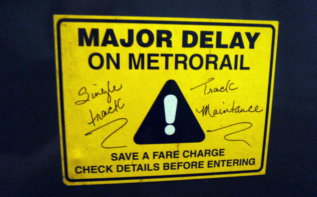
Error recovery: Signs outside the paid station area alert DC Metrorail passengers to delays. Photo credit: Daniel Lobo, Flickr
9. Help users recognize, recover from errors: Error messages should be expressed in plain language (no codes), precisely indicate the problem, and constructively suggest a solution.
When things go wrong in a transportation system – either by user or operator error – users need clear explanations and constructive suggestions for workarounds. For instance:
- Variable message signs announcing train delay and expected wait time so passengers can make informed decisions about alternatives;
- Signs posted at bus stop indicating stop is closed, for how long, and where passengers can find the next closest station;
- At full bikeshare station, kiosk indicates location of next closest station with available docks.
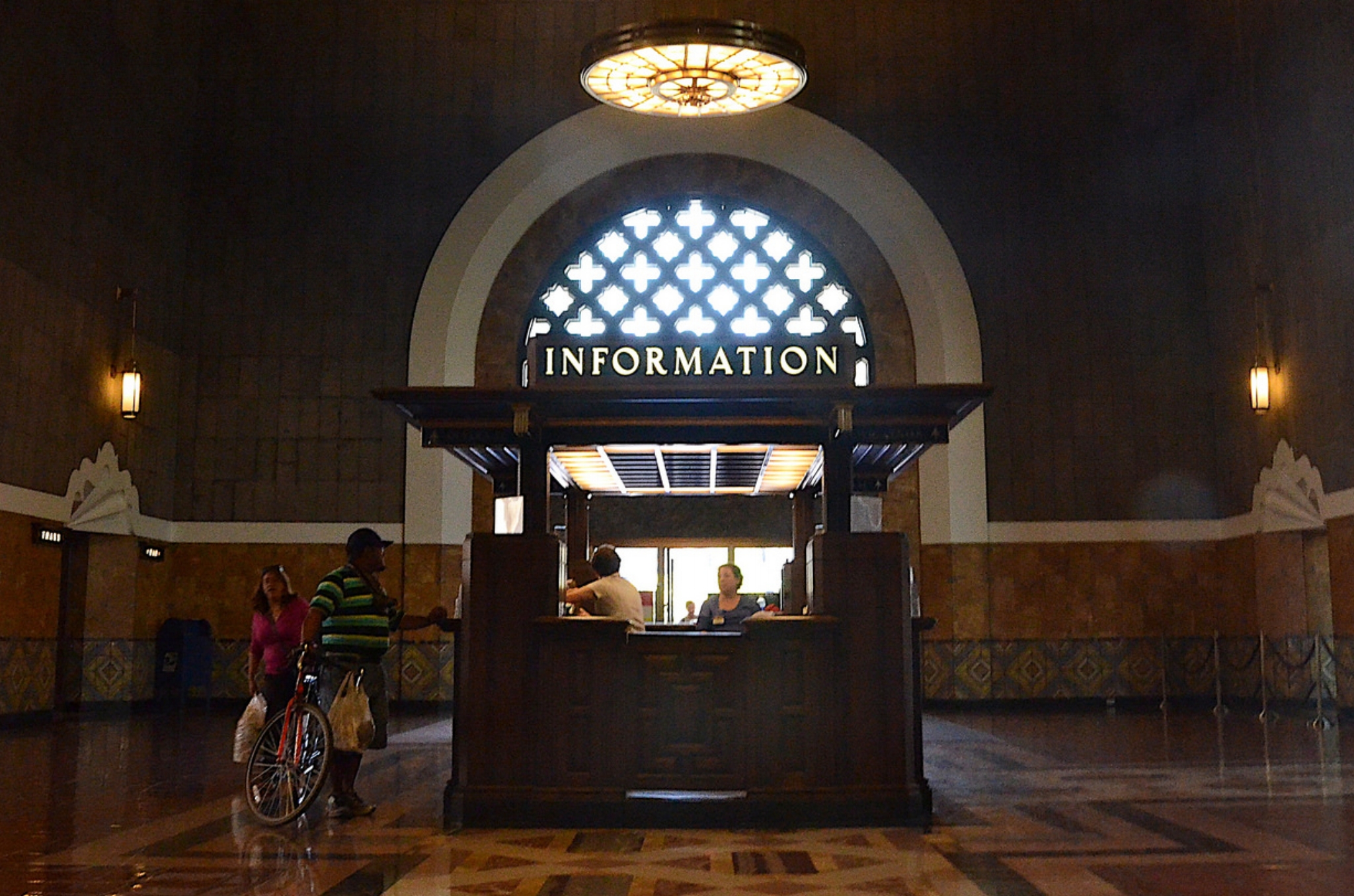
Help & documentation: A staffed information booth at Los Angeles' Union Station. Photo credit: Russell Mondy, Flickr
10. Help & documentation: Even though it is better if the system can be used without documentation, it may be necessary to provide help and documentation. Any such information should be easy to search, focused on the user's task, list concrete steps to be carried out, and not be too large.
Public transportation users occasionally need help using the system. Information should be readily available to users in different formats. It may be especially important to educate users about how to use a new transit service. Examples of good public transportation help and documentation include:
- Information kiosks at airports, transit stations, city centers;
- How-to guides sent to new carshare members explaining how to borrow a car, fill-up with gas, pricing, etc;
- User education campaigns prior to new BRT launch. Guadalajara’s Macrobus BRT team conducted extensive outreach explaining the new service to current bus riders and students;
- Fort Collins’ Transfort offers free MAX BRT travel training every third Thursday to help users get comfortable using the transit service.
[Post script]
I think an eleventh usability heuristic is needed as well -- universal design. Certainly public transit, and other user interfaces, ought to be usable by people with various abilities. Interfaces should be flexible and accommodating of people with limited vision, hearing impairments, and other physical and cognitive limitations.